 Pete Freitag
Howto Build a Form That Isn't Annoying (Part 2)
By Pete Freitag
This is the second part of my multi-part series called: How to build a form that isn't annoying. After posting part 1 I received lots of great feedback in the comments.
In particular Paul Hastings, the i18n advocate in the ColdFusion community pointed out some potential problems with using country codes, citing that there are many users who would have no idea what their country's code is, and that it's best to provide country names in the language of the user.
Feedback and discussion were one of the goals of the series. I'm challenging you to think a bit different about how you design forms. So thanks Paul, and others that commented on the last article.
Now lets get on with Part 2
Use Scripting to enhance the experience not hinder it
If your going to use scripting (javascript, AJAX, flash) in your form make sure you do so in a way that is degradable. In otherwords you should still be able to submit the form if JavaScript is turned off.
There is nothing worse than a form that you can't submit due to a javascript bug.
Let's not forget FEMA's disaster relief form that only worked on IE.
Alignment and Spacing are important
I think the one thing that makes or breaks any design is the alignment and spacing. Good design typically has aligned objects with adequate spacing. Poor design is typically not aligned, and has very little spacing between elements.
I'm sure there must be many psychological reasons for this. Our brains I think correlates alignment with cleanliness. When I see a clean organized form I feel a bit more comfortable giving up information.
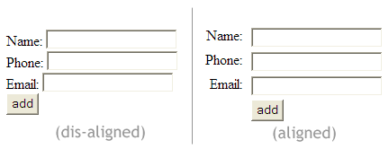
It's not too hard to use CSS to style and align a form. Infact the difference between the two forms shown above is just two lines of CSS. Their markup is exactally the same.
If a form is messy, and unorganized I typically tend to associate that image with the web site or company. It also tips me off to the fact that the web developer was to lazy to apply some style to the form. Do I trust that my information will be kept secure and private, or were they lazy when it came to that as well I wonder. Ok enough rant on this one.
Stay tuned for Part III, and as always please post your thoughts below in the comments.
Howto Build a Form That Isn't Annoying (Part 2) was first published on May 03, 2006.
If you like reading about forms, usability, or html then you might also like:
- Web Design Tips for Programmers
- Uploading Files Like GMail Attachments
- Accessibility and Usability in Forms Outline
- Styling Your forms with CSS and Labels
Another interesting point here is to note that you should use both the name and id attributes on your input elements. This way, you can activate an input by clicking its label (in most modern browsers) - an easy way to enhance the usability of your form.
For example:
<code>
<label for="name-first">First Name:</label>
<input type="text" name="name-first" id="name-first" />
</code>
Hope this is useful,
Andy